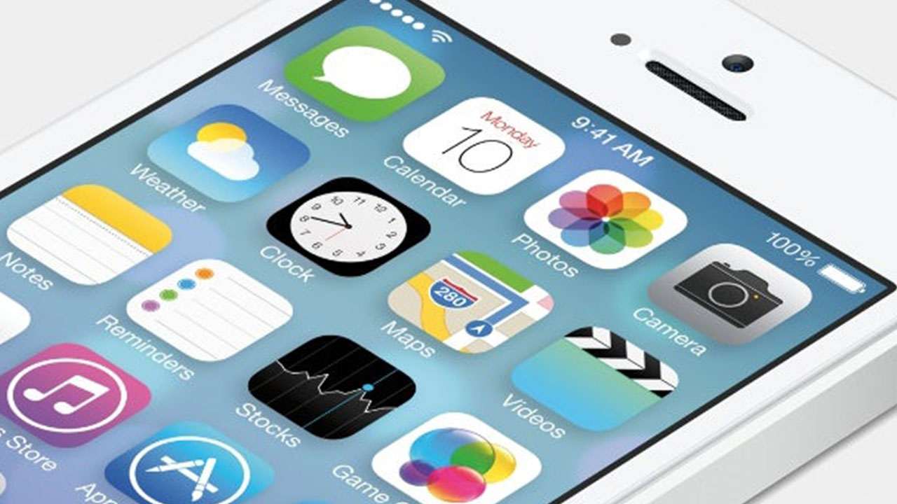
One of the first ways that you have to make your application stand out on the app store is to have an attractive app icon.
Your app icon makes a critical first impression and it is from that point that you need to appeal to users with your app name and app store description once you have established that initial interest.
Given the amount of screen real estate and prominence the app icon gets both in the app store (initial exposure) and on the device (encourage repeated use) the app icon can have the potential to make or break an app.
A powerful app icon should be able to catch people’s attention and communicate in seconds what an app is all about and it is in that moment that users will decide if they want to read your app store description or download your app.
Here are some critical app design elements that you might want to take into consideration when creating an icon for your app:
- Design – A lot of decisions here will depend on your ability or desire to include the app name in the icon. If you have a short app name and it can be included without overcrowding the icon, then go for it otherwise if you have a long title, don’t even bother trying to squeeze it in. Any text or images should be clear and easy to make out on a small screen and the icon shouldn’t be overcomplicated or crowded. If you work with a graphic designer you should be able to create an eye-catching icon that is easy to read and recall.
- Colour – Choosing the right colours is as important as getting the overall design right and the two often go hand-in-hand. Try to make your app icon stand out from the crowd without being too over the top and make sure that the colours you choose are appropriate for the subject or genre of the app.
- Quality – A professional graphic designer should be able to provide you with high quality copies of your icon designs that are crystal clear and meet the design specifications for the devices you are targeting. A poor quality app design can make a difference to your success and this is a critical area where only the best will do.
- Context – Does your app icon make sense when considered in context with the content you have in your app? As the old saying goes, a picture is worth a thousand words, your app icon should be aligned with the name and functionality of the app.
Designing a good app icon is just one of the many factors that contribute to a successful app but first impressions count and your app store icon is the cornerstone of that.

